
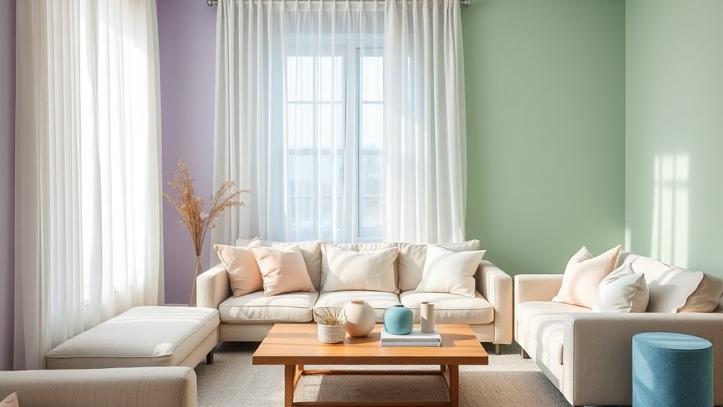
To use color psychology for calm spaces, select soft, muted shades like lavender, pale blue, and gentle greens that promote emotional stability and relaxation. Incorporate natural light with large windows or skylights, and use natural materials such as wood, linen, and stone to enhance tactile comfort. Balance warm and cool tones, and employ consistent, harmonious colors throughout your decor to create visual stability. Integrate calming focal points like plants or art, and layer textures to deepen tranquility—exploring these elements more can transform your environment.
Key Points
- Select soft, muted hues like pastel blues, lavenders, and blush to promote relaxation and emotional comfort.
- Incorporate natural textures and materials, such as wood and linen, to enhance tactile calmness and connection to nature.
- Use neutral backgrounds and balanced color schemes to create harmony and reduce visual overstimulation.
- Maximize natural light to amplify calming color effects and foster an inviting, open environment.
- Maintain consistency in color choices across decor, furniture, and lighting to reinforce a peaceful, mindful atmosphere.
Selecting Soothing Color Palettes for Relaxation
When selecting color palettes for relaxation spaces, choosing soft, muted shades can markedly enhance the calming atmosphere you aim to create. Soothing color palettes often feature gentle hues like light pastel colors—lavender, blush, or pale blue—that lower heart rates and foster emotional comfort. Incorporating a monochromatic palette with low saturation reduces visual stimulation, promoting tranquility and stability. Natural-inspired colors, such as earthy browns and soft greens, deepen feelings of harmony and connection to nature, reinforcing a sense of calm. Balancing warm and cool tones, like soft beige combined with pale blue, supports emotional stability and creates a cohesive environment conducive to relaxation. By prioritizing these muted shades and natural-inspired palette choices, you cultivate a space that nurtures emotional comfort, inspires serenity, and encourages a harmonious, tranquil atmosphere—ideal for unwinding and rejuvenation.
Incorporating Natural Light and Materials
Maximizing natural light through strategic placement of windows and skylights enhances the calming qualities of soft, cool colors, creating a space that feels open and inviting. Incorporating natural textures like wood, stone, or bamboo adds warmth and sensory richness that complement the light’s soothing effects. Together, these elements forge a harmonious environment that promotes relaxation and well-being.
Maximize Sunlight Exposure
Enhancing natural light in calm spaces is essential for fostering a tranquil atmosphere, as increased sunlight elevates serotonin levels and encourages relaxation. To maximize sunlight exposure, incorporate large windows, skylights, or glass doors that facilitate ample daylight penetration, creating a bright environment that promotes well-being. Reflective materials like light-colored walls or glossy surfaces amplify natural light, enriching the organic ambiance and reducing reliance on artificial lighting. Position seating and work areas near windows to ensure direct sunlight benefits your daily routine, helping to regulate circadian rhythms. Using natural materials such as wood, stone, or bamboo complements sunlight, fostering a soothing space that supports light therapy and overall calmness. These strategies collectively enhance the calming qualities of your environment through thoughtful integration of natural light and materials.
Use Natural Textures
Incorporating natural textures like wood, stone, and rattan can transform a space into a calming sanctuary by adding warmth and organic visual cues. These textures evoke a sense of tactile comfort, grounding your environment in nature’s soothing effects. Maximizing natural light through large windows or skylights reduces reliance on artificial lighting, enhancing relaxation and mood. Soft muted colors paired with natural textures amplify the calming atmosphere, making your space feel more peaceful and restorative. Using natural materials like linen, cotton, or wool in furnishings further connects you to nature’s tranquility, promoting relaxation. Gentle sunlight filtering through sheer curtains can soften textures and colors, creating a serene ambiance. Together, these elements foster restorative spaces that nurture calm and well-being.
Balancing Colors to Avoid Overstimulation
To prevent overstimulation in your space, it’s essential to carefully balance the use of colors, ensuring that vibrant hues don’t overwhelm your senses. Incorporate muted tones and calming hues, like soft blues and gentle greens, to foster relaxation and provide visual rest. Limit the use of highly saturated, warm colors such as bright oranges or yellows, as these can increase alertness and cause overstimulation. Instead, use neutral backgrounds—white, beige, or gray—to create a grounding effect and prevent color fatigue. Strategic placement of soothing colors and balancing colors throughout the space helps maintain harmony and reduces sensory overload. Soft, diffused lighting can further soften intense colors, enhancing the calming atmosphere. By thoughtfully managing your color palette, you’ll create a balanced environment that promotes tranquility, minimizes overstimulation, and encourages a sense of peace and well-being.
Using Decor and Textiles to Enhance Calmness
By choosing decor and textiles in soft, muted hues like pastel blues, greens, and lavenders, you can create a serene environment that promotes relaxation. Incorporating natural fibers such as cotton, linen, or wool adds calming textures that subtly enhance the tranquil atmosphere. Opting for matte or low-sheen finishes in these materials minimizes visual noise, further supporting a sense of calm.
Soft Color Palettes
Soft color palettes, characterized by muted shades of blue, green, beige, and pastel tones, play a crucial role in creating calm and inviting spaces. These gentle hues evoke tranquility and considerably reduce visual stress, fostering a soothing atmosphere. Layering soft colors with natural materials like wood, linen, and cotton amplifies the sense of harmony and relaxation. Incorporating plush textiles such as velvet cushions, throws, and upholstered furniture in these muted shades enhances sensory comfort, promoting a peaceful space. Using matte or low-sheen finishes on walls and decor minimizes glare, further supporting a calming environment. Strategic placement of muted tones in lighting fixtures and drapery diffuses harsh light and shadows, ensuring a tranquil, restful ambiance.
| Soft Color Palettes | Natural Materials | Textural Elements |
|---|---|---|
| Muted shades of blue, green | Wood, linen, cotton | Velvet cushions, throws |
| Pastel tones | Layering soft colors | Upholstered furniture |
| Beige hues | Diffused lighting | Matte finishes |
Natural Textural Elements
Incorporating natural textures such as wood, rattan, and linen into your decor creates a calming connection between indoor spaces and the natural world. These organic materials introduce tactile richness that enhances sensory engagement, fostering a soothing decor that promotes serenity. Layered textures in neutral palettes—think woven throws, plush rugs, or cork accents—add depth without overwhelming the senses, amplifying the calming environment. Using authentic natural elements evokes a sense of authenticity and tranquility, grounding your space in simplicity and comfort. The tactile qualities of materials like jute or cotton contribute to a genuine, inviting atmosphere, encouraging relaxation. By thoughtfully integrating natural textured elements, you craft a space that embodies serenity and mindfulness through subtle, yet powerful, design choices.
Creating Focal Points With Calming Colors and Art
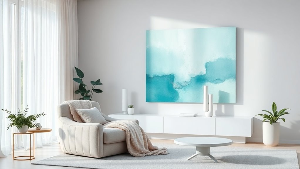
Creating focal points with calming colors and art involves thoughtfully selecting elements that draw the eye while maintaining a sense of serenity. Use focal art with serene imagery and soothing color palettes—such as soft blues, gentle greens, and muted lavenders—to anchor a space and foster visual tranquility. Incorporate artwork strategically in areas prone to stress or activity, encouraging mental pauses that promote relaxation and reduce anxiety. Brighten these focal points with natural light or warm accent lighting to enhance their calming effect and emphasize their importance in the room’s harmony. When choosing decor and artwork, prioritize pieces that evoke peace and stability, creating a cohesive environment centered around visual rest. By carefully highlighting focal art and utilizing calming colors, you establish a sense of quiet serenity that invites relaxation and supports a tranquil atmosphere. This approach ensures your space becomes a haven of peace and visual tranquility.
Maintaining Consistency to Foster Tranquility
Building on the calming effects of thoughtfully selected focal points, maintaining consistency in your color choices plays an essential role in fostering a tranquil environment. Color consistency, such as using calming colors like soft blues, gentle greens, and neutral tones, reinforces a cohesive atmosphere that encourages relaxation. Uniform color schemes across walls, furniture, and decor reduce visual stress, helping your mind achieve clarity and focus. Repeating a soothing palette throughout different areas prevents distraction and promotes a sense of stability, which positively influences mood and behavior. When lighting, textiles, and decorative elements align with your chosen color theme, they strengthen the overall sense of tranquility and mindfulness. Consistent application of these principles cultivates a peaceful space where mental clarity and relaxation flourish, making your environment not only visually soothing but also emotionally supportive. This uniformity ultimately nurtures a calming ambiance that sustains mindfulness and serenity.
Common Questions
What Color Stimulates Calmness?
Blue stimulates calmness, embodying a soothing color association that promotes mood enhancement, visual comfort, and emotional response. Its calming psychological effects are amplified by color harmony and low saturation, which reduce sensory perception stress. You’ll find that soft, muted shades of blue align with personal color preferences and symbolize tranquility, fostering a serene atmosphere. Using blue thoughtfully creates a harmonious environment, where calming influence and psychological well-being are naturally cultivated through subtle, deliberate color choices.
What Is the 70 20 10 Rule for Colors?
The 70/20/10 rule for colors guides your space’s color harmony by allocating 70% to calming, neutral tones with low saturation, creating a peaceful foundation. About 20% can feature accent colors with balanced color contrast and complementary hues to add interest. The remaining 10% involves bold, vibrant shades for energy, ensuring color branding and seasonal palettes align with cultural meanings. Use mood boards for paint selection, considering color accessibility and cultural context.
What Is the 60 30 10 Rule for Bedrooms?
In your bedroom, the 60/30/10 rule creates harmonious color balance, blending soft neutrals on walls with secondary tones on furniture for seamless color shifts. Accent walls or carefully chosen accessories introduce subtle contrast, enhancing mood without overwhelming. Thoughtful paint selection and lighting effects amplify calming effects, while curated bedroom accents and furniture coordination maintain visual unity, ensuring each element supports your desired tranquil atmosphere through strategic color harmony and purposeful accent color placement.
Which Color Is Best for a Calm Mind?
The best color for a calm mind is blue, thanks to its strong color associations with tranquility and stress reduction. In interior design tips, incorporating soft blue hues enhances mood, promotes emotional balance, and creates visual harmony. Blue’s psychological effects, supported by color therapy, foster relaxation and mental clarity. Using calming palettes and mindful color choices can notably elevate aesthetic appeal while supporting a peaceful, harmonious environment.